
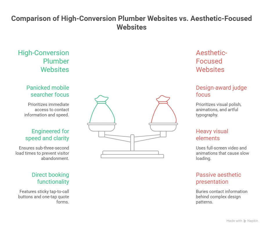
Search “best website design for plumbers” and you’ll find galleries of beautiful sites – full-screen video, slow fade animations, artful typography. Most of them are quietly haemorrhaging work. A customer with a burst pipe doesn’t care about your hero video; they care whether they can tap your number in under three seconds. The best plumber website designs in Australia aren’t the prettiest. They’re the ones engineered around one panicked person holding a phone.
Get this wrong and the cost is invisible but brutal: every slow load, buried phone number, or generic homepage sends a ready-to-book customer back to Google to call the next plumber. This post breaks down the 15 design patterns that separate sites that book jobs from sites that just sit there.
Each example below is a pattern you can copy – not an unrepeatable art project.
Quick answer: The best website design for plumbers in Australia shares a consistent set of patterns: a sub-three-second mobile load, a sticky tap-to-call button, an emergency-first homepage, suburb-level service pages, prominent Google reviews, and a one-tap quote form. Visual polish matters far less than speed and clarity – 53% of mobile visitors abandon a site that takes over three seconds to load, and 75% judge a business’s credibility on its website. The strongest plumber sites optimise for the panicked mobile searcher first and the design-award judge never.
What Separates a 'Best' Plumber Website from a Pretty One
Before the 15 examples, the scoreboard. These are the metrics the best plumber websites win on – and they have almost nothing to do with how the site looks in a portfolio.
| Design Factor | Why It Matters | The Benchmark to Beat |
|---|---|---|
| Mobile load speed | Emergency searches happen on phones, often on mobile data | Under 3 seconds (53% abandon if slower) |
| First impression | Users decide if you look credible almost instantly | ~50 milliseconds to form a visual judgement |
| Tap-to-call visibility | Most plumbing jobs convert by phone, not form | Call button visible without scrolling |
| Local relevance | Google ranks suburb-specific pages in the Map Pack | A page per core service + suburb |
| Trust signals | Customers compare 2-3 plumbers before calling | Live Google reviews above the fold |
Benchmarks drawn from Google/SOASTA mobile speed research, the Stanford Web Credibility Project, and Think with Google local-search data.
The 15 Best Plumber Website Design Examples (and the Pattern Behind Each)
Each “example” below is a repeatable design move you’ll find on the highest-converting Australian plumber sites. Steal them.
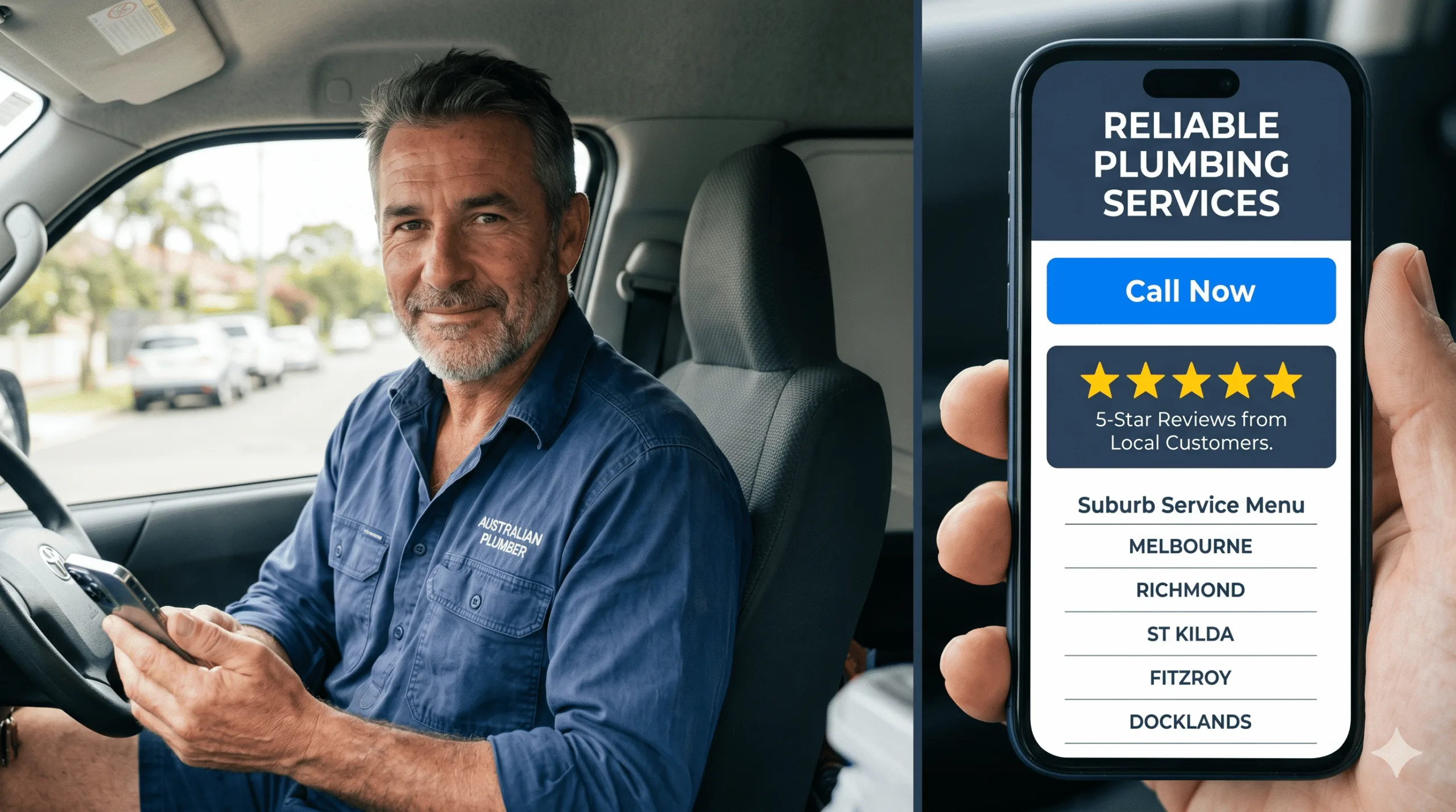
1. The Emergency-First Homepage
The single strongest pattern. The first screen states the job-to-be-done – “24/7 Emergency Plumbers, [City]” – with a giant call button and nothing else competing for attention. No carousel, no mission statement. A distressed customer knows in one second they’re in the right place.
2. The Sticky Tap-to-Call Bar
A call button pinned to the bottom (mobile) or top (desktop) of every page, on every scroll position. This one element routinely lifts call volume more than any redesign of the homepage, because it removes the “where’s the number?” friction entirely.
3. The Suburb Service Page Grid
Instead of one generic “Areas We Serve” paragraph, the best sites build a dedicated page per suburb and service. This is what feeds the Google Map Pack and ranks you for “blocked drain [suburb]” searches your competitors ignore.
4. The Live Google Reviews Strip
Real, auto-updating 5-star Google reviews placed high on the page – not a static testimonial in the footer. Social proof is what converts a visitor who has three plumber tabs open and is deciding who to call.
5. The One-Tap Quote Form
A short form – name, suburb, problem, photo upload – above the fold. It captures the customer who’d rather type than call (often after hours) without making them dig through a menu.
6. The 'What It Costs' Honesty Block
A pattern more Australian plumbers are adopting: an indicative pricing or call-out-fee section. It pre-qualifies leads, builds trust, and answers the question every customer is silently asking before they ring.
7. The Trade-Credential Trust Row
ARC licence numbers, Master Plumbers Association membership, insurance and warranty badges displayed near the top. For higher-value renovation and gas work, these signals do real conversion work.
8. The Before/After Gallery
Real job photos – a re-piped bathroom, a cleared drain, a new hot water unit – beat stock imagery every time. They prove the work is real and let customers picture their own job done.
9. The Service-Specific Landing Pages
Separate, fully built pages for hot water, blocked drains, gas fitting, leak detection and bathroom renovations. Each targets its own search intent instead of cramming everything onto one “Services” page that ranks for nothing.
10. The Click-to-Call Phone Number (Not an Image)
Sounds obvious; constantly broken. The number must be real HTML text wrapped in a tel: link so mobile users tap to dial. Phone numbers baked into images can’t be tapped – and can’t be read by Google.
11. The Fast, Compressed Imagery
The best plumber sites look rich but load light: properly compressed WebP images, lazy loading, and no autoplay video on mobile. They pass Core Web Vitals because speed is treated as a design feature, not an afterthought.
12. The 'Book Online' Scheduler
For non-emergency work – tap installs, inspections, quotes – an embedded booking calendar converts browsers into confirmed appointments while you’re under a sink, not waiting for a callback.
13. The Clear Service-Area Map
A simple map or suburb list that instantly answers “do you even come to me?” Removing that doubt in the first screen stops customers bouncing to check a competitor’s coverage.
14. The Mobile-First Navigation
A stripped, thumb-friendly menu with the three things customers actually want – Call, Services, Areas – not a desktop mega-menu crammed onto a phone. The best sites design for the 80%+ of plumbing traffic that’s mobile, then scale up.
15. The Single, Obvious Call to Action
Every page drives to one action: call or book. The weakest plumber sites offer five competing buttons; the best ones make the next step impossible to miss. Clarity outconverts cleverness every time.
The Pattern Most Plumber Websites Still Get Wrong in 2026
If you audit Australian plumber sites against the 15 patterns above, the same gaps appear again and again – and they’re not cosmetic.
Speed Is Still the Silent Killer
Plenty of “nice-looking” plumber sites fail Core Web Vitals because of heavy hero videos and uncompressed images. A site that takes five seconds on 4G has already lost the customer. Speed isn’t a technical nicety; it’s the first design decision.
The Lead-Platform Trap
Many plumbers skip a proper website entirely and rely on hipages or Airtasker. The problem: those platforms charge per lead and send the same enquiry to several competitors, so you pay repeatedly and never own the customer. A site you control flips that maths.
Here’s the worked example:
| Lead Source | Year-One Cost | Who Owns the Customer | Cost Per Booked Job Over Time |
|---|---|---|---|
| Lead platform (per-lead fees) | Recurring on every enquiry | The platform | Stays high – you pay every time |
| Your own website | One build cost (~AUD $2,000-$6,000) | You | Falls with every job it books |
A AUD $3,000 website that books 40 jobs in its first year costs you $75 per job – and keeps working in year two for free. A per-lead platform never stops charging.
How to Apply These Patterns to Your Own Plumbing Website
You don’t need all 15 on day one. Start with the ones that move the needle fastest:
- Add a sticky tap-to-call button to every page – usually the single biggest call-volume win.
- Cut your mobile load time under three seconds by compressing images and removing autoplay video.
- Put live Google reviews above the fold and a one-tap quote form in the first screen.
- Build suburb service pages for your core jobs so you start appearing in the Map Pack.
If your current site misses most of these, a focused rebuild usually pays for itself in months. Webco’s plumber website design is built around exactly these patterns – fast, mobile-first, and measured by booked jobs rather than design awards. If you’d rather see where your existing site leaks leads first, we’ll audit it for free.
Frequently Asked Questions
What makes the best website design for plumbers?
The best website design for plumbers prioritises speed and clarity over visual flourish. It loads in under three seconds on mobile, leads with a sticky tap-to-call button, states the service and area in the first screen, and surfaces live Google reviews for trust. Suburb-level service pages handle local SEO, and a one-tap quote form captures after-hours leads. In short: design for the panicked mobile searcher first.
How much does a good plumber website cost in Australia?
A professional plumber website in Australia typically costs between AUD $2,000 for a focused lead-generation site and AUD $6,000+ for a larger custom build with multiple suburb pages and integrations. Cheaper template sites exist, but they often miss the speed, local-SEO and conversion patterns that actually book jobs. The right way to judge cost is per booked job over the site’s life, not the upfront price alone.
Are plumber website templates good enough?
Templates can work as a starting point, but most fail on the patterns that matter: mobile speed, sticky tap-to-call, and proper suburb service pages. A template that loads slowly or buries your phone number will quietly lose jobs no matter how it looks. If you use one, optimise ruthlessly for load time and conversion, or have a specialist rebuild the high-impact elements.
Should plumbers use hipages instead of a website?
Lead platforms like hipages and Airtasker can supplement work, but they shouldn’t replace your own website. They charge per lead and resell the same enquiry to competing plumbers, so your cost stays high and you never own the customer relationship. A website you control turns one build cost into an asset that books jobs at a falling cost per lead over time.
What's the most important feature on a plumber website?
If you can only fix one thing, make it the tap-to-call button – visible on every page without scrolling, wrapped in a real tel: link so mobile users dial in one tap. Most plumbing jobs convert by phone, often in an emergency, so removing every second of friction between the visitor and the call is the highest-leverage design decision you can make.